I’ve just realised that Her Majesty’s government has released the results of the 2011 (!) census at the level of individual output areas. Output areas are small, socially homogeneous cells with an average size of about 300 residents. In other words: The information is incredibly detailed, which is a bit worrying on one level (I see your prism and raise you a Tempora), but on another level quite exhilarating. And that is because HM has also released various geographies, meaning that it is comparatively easy to find and plot these clusters of people in space. The possibilities for social research are endless (but don’t bother looking for a link here – these data are distributed and duplicated over various sites run by the ONS, the Ordnance Survey, Edina, UK data etc., so it’s best to google “output area” and start digging from there).

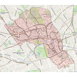
This nice map of Camden is just an illustration for a paper I am currently working on. It was created using the very useful sp and OpenStreetMap packages for R and shows the borough’s 18 electoral wards (the pinkish polygons) as well as the population weighted centroids for the output areas contained in these wards.
The upshot is that people are sometimes very unevenly distributed within wards (perhaps unsurprisingly, nobody lives on Hampstead Heath), so if you are looking for neighbourhood effects on voting behaviour, even the very detailed ward level data can be misleading. In an ideal world, we would get electoral counts at the output area level, but even I can see that this might be a bit problematic.
Discover more from kai arzheimer
Subscribe to get the latest posts sent to your email.
