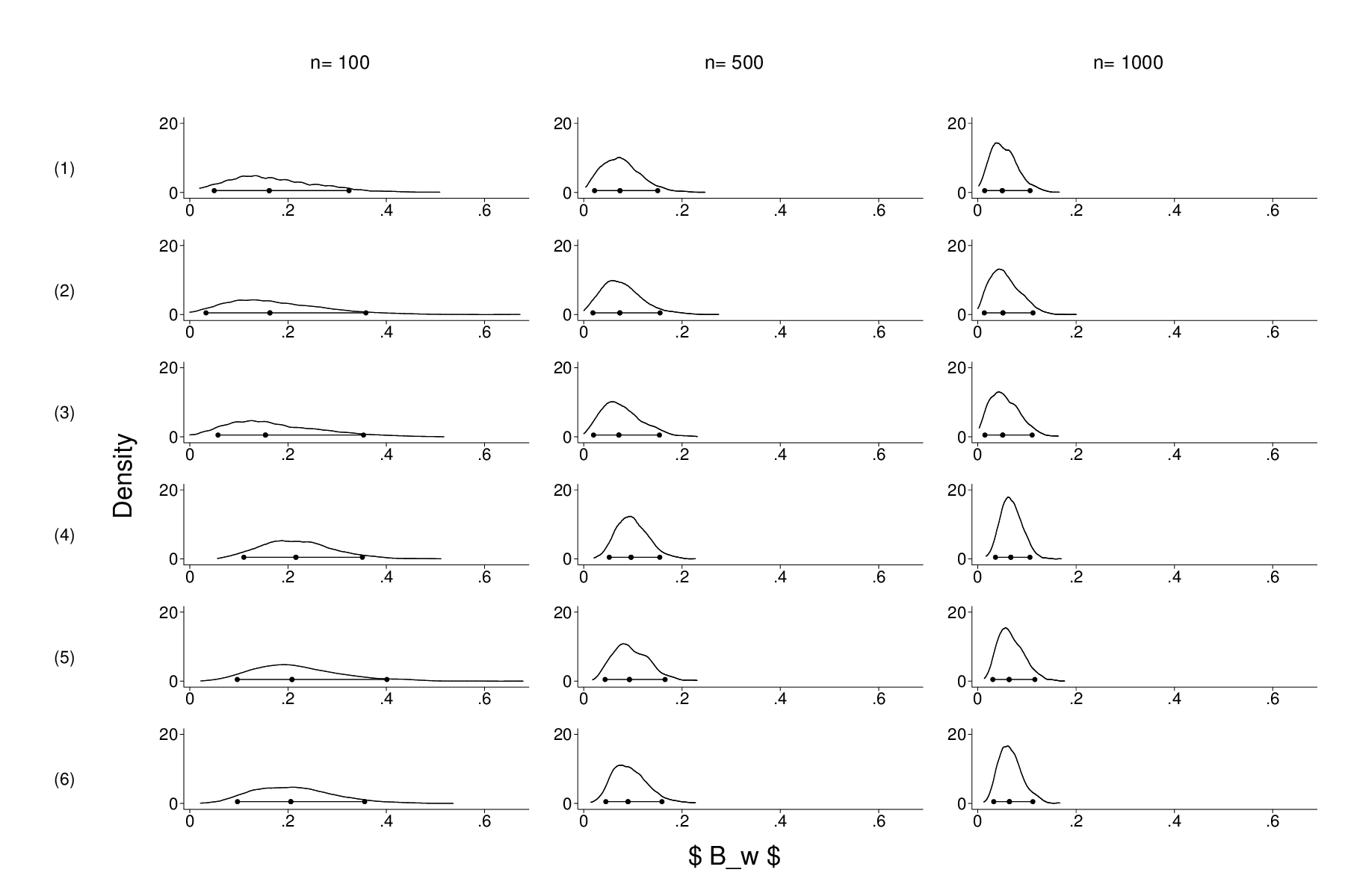
Do you like this graph? I don’t think it is particularly attractive, and that is after spending hours and hours creating it. What I really wanted was a matrix-like representation of 18 simulations I ran. More specifically, I simulated the sampling distribution of a statistic under six different conditions for three different sample sizes. Doing the simulations was a breeze, courtesy of Stata’s simulate command, which created 18 corresponding data sets. Graphing them with kdensity also poses no problem, but combining these graphs did, because I could find no canned command that produces what I wanted: a table-like arrangement, with labels for the columns (i.e. sample sizes) and rows (experimental conditions). What I could do was set up / label a variable with 18 categories (one for each data set) and use the ,by() option to create a trellis plot. But that would waste a lot of ink/space by replicating redundant information. At the end of the day, I created a nine graphs that were completely empty save for the text that I wanted as row/column labels, which I then combined into two separate figures, that were then combined (using a distorted aspect ratio) with my 18 separate plots. That boils down to a lot of dumb code. E.g., this creates the labels for the six conditions. Note the fxsize option that makes the combine graph narrow, and the necessity to create an empty scatter plot.
 capture drop x
 capture drop y
 capture set obs 5
 gen x= .
 gen y= .
local allgraphs = “”
forvalues c = 1/6 {
graph twoway scatter x y, xtitle(“”) ytitle(“”) xscale(off) yscale(off) subtitle(“(`c’)”,position(0) nobox) graphregion(margin(zero)) plotregion(style(none))
local allgraphs “`allgraphs’ condition`c'”
graph rename condition`c’ , replace
}
graph combine `allgraphs’ , cols(1) colfirst imargin(0 0 0 0) fxsize(10) b1title(” “)
The column labels were created by similar code. Finally, I combined my 18 graphs (their names are in the local macro) and combined the results with the label graphs.
 graph combine `graphs' ,colfirst cols(3) ycommon xcommon imargin(3 3 3 3) b1title("\$ B_w \$") l1title("Density")
 graph rename simulations, replace
 graph combine sizelabels.gph condlabels.gph simulations, imargin(0 0 0 0) cols(2) holes(1)
Can anyone of you think of a more elegant way to achieve this result?


How would you do that in R #graphenvy
ggplot(data, aes(x = var)) + geom_density() + facet_wrap(y_facet ~ x_facet)
getting it that ugly will be more work however 🙂
+theme_1990s()+theme_what_i_learned_in_gradschool()?
“Can anyone of you think of a more elegant way to achieve this result?”
You mean other than switching to R? *ducks*